Home Decor Print, "The Alphabet Tree" At first this image looks like a silhouette, when you look closer you can see all the letters of the Alphabet. Its kind of a fun little puzzle print.
I designed this for a friend. They wanted an elegant welcome sign to frame and hang in their home.
I designed this print for a friend who was looking for an alphabet bicycle print. She chose to go with blue for the background, because it matched her sons room. This is a neutral color, to hang anywhere!
I designed this flyer for a client who had a landscaping business. It was mailed out in about 1000 newspapers. I designed the logo as well. Clean and simple! With organic shapes for nature!
This was a print I designed for home decorating.
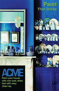
We had to design a paint poster in one of my college classes the above and below picture are the two I came up with. I prefer the one below, but I had to have a couple different designs.
I flyer I designed for an ad campaign, we were trying to come up with a whole new branding campaigns saying that "Vintage" is the new Elegant! "Vintage is the New Black" It worked well!
This was a magazine spread I designed in InDesign. I think it worked out well! I used light baby blue and brown, for "relaxation". I love using Color Theory in my work. Did you know that the way you use color in your design, will give it the feel you want, or the mood you want to bring out! Color Theory is all around us!
This is a recipe book cover I designed for my own recipe book! I love the colors. I used many complimentary colors in this piece.
I designed 3 posters for a printing company. I used a colorful hippy theme. These posters were really fun! I used illustrator and photoshop for them!
A flyer I designed for a Vintage Clothing Company! I designed it in Adobe InDesign.

I have been designing some Graphic Art Prints, for framing. These are simple but cute!


